
What is the difference between the five Menu Types in SW Header Mega?
Each Mega Panels card uses a Menu Type to control the desktop experience:
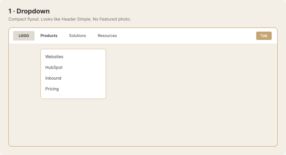
- Dropdown: A compact flyout without a Featured image. View the Dropdown example.
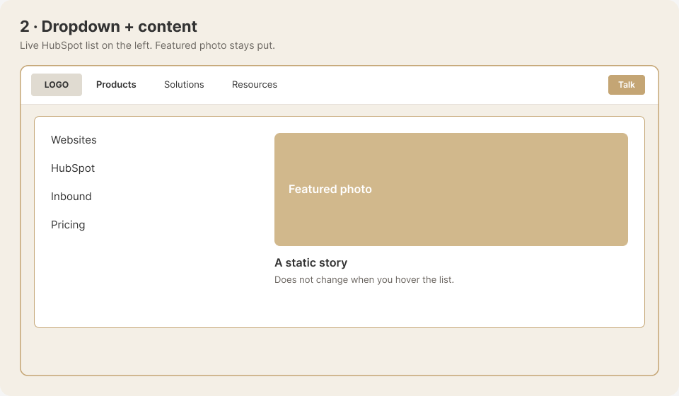
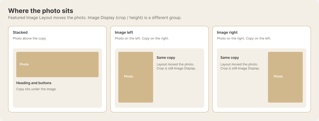
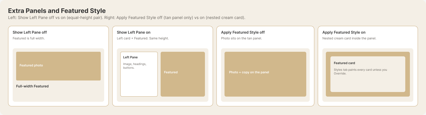
- Dropdown + content: A live HubSpot menu list paired with Featured content. View the Dropdown + content example.
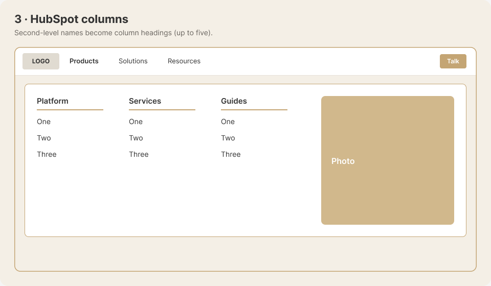
- HubSpot columns: Second-level HubSpot menu items become column headings, with up to five columns plus Featured content. View the HubSpot columns example.
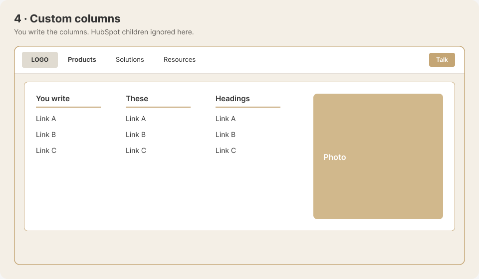
- Custom columns: You write the desktop columns, while HubSpot child items are not shown there. Featured content remains available. View the Custom columns example.
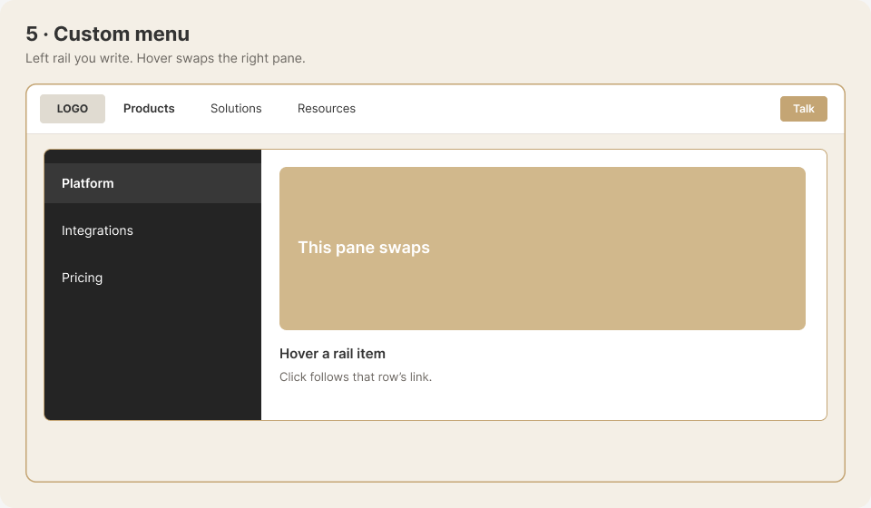
- Custom menu: You write a left-side menu whose hovered item changes the content on the right. View the Custom menu example.
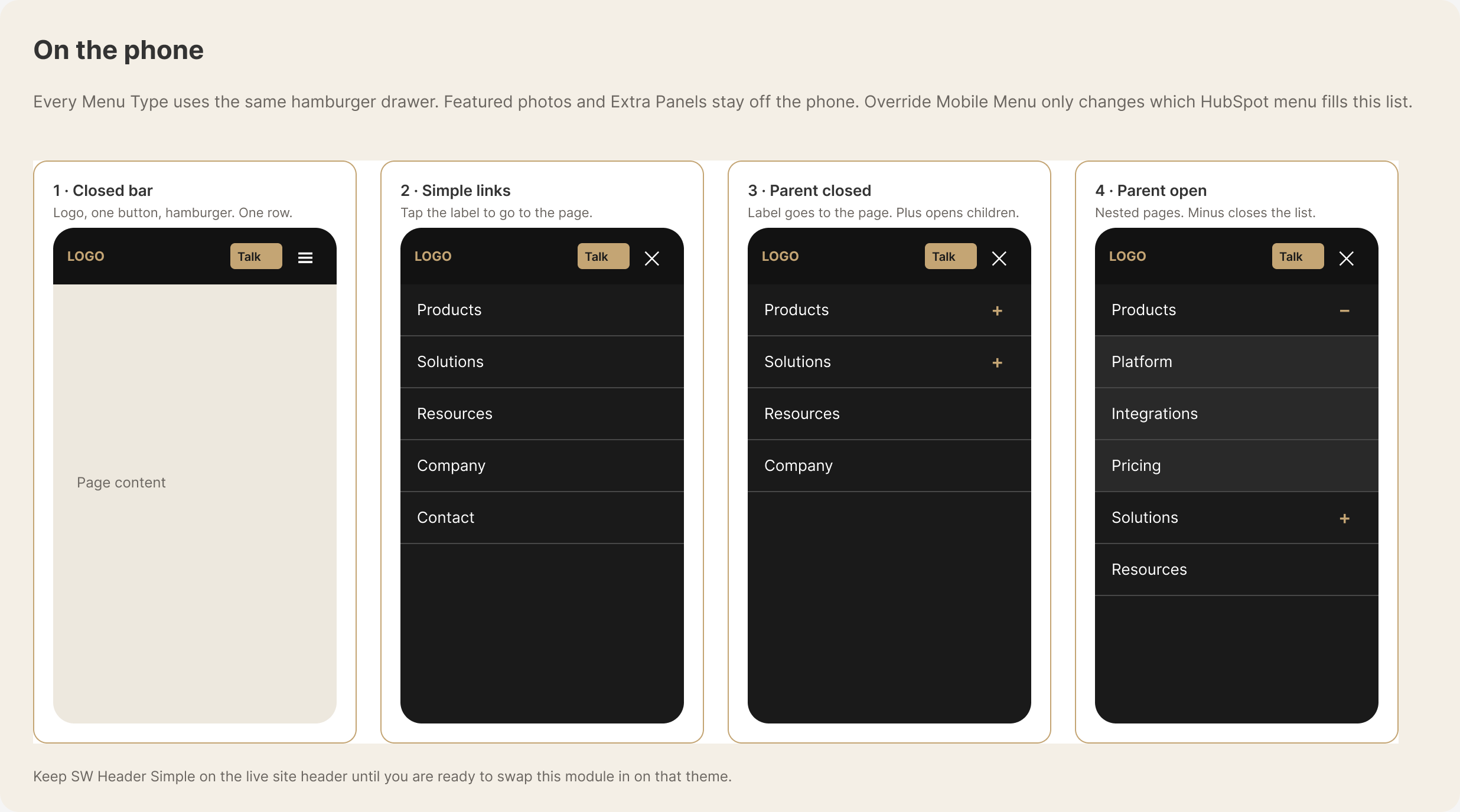
On phones, all five types use the same hamburger menu.