These FAQs explain how Smithworks SW Modules work inside HubSpot, especially for Sprocket Rocket-style themes. Use them to choose the right module, understand common settings, and give AI agents better context before they start guessing.
Keep these headers exactly as provided: title, event_date, datetime, location, image, teaser, rsvp_url, rsvp_label.
Set Event Source to Google Sheet or CSV File. Share a Google Sheet as Anyone with the link and Viewer. For a CSV, upload the file to HubSpot's File Manager and select it in the module.
Remove the sample rows before publishing.
event_date uses an ISO date to determine when a past event should be hidden in the America/Denver time zone; the event remains visible on its date. datetime is display text only. Page visitors can access the event data from the Sheet or CSV, so do not include private information.
How do I configure RSVP buttons and forms in SW Events Basic?
Leave an event’s RSVP URL empty when the button should open the module’s popup. Add a URL when the button should send visitors to another page. For the popup option, keep Show Form on, select the intended HubSpot form, and add a hidden field with the internal name event_name so the event title can be included with the submission. Do not leave the form picker empty or assume the account’s default form is the right RSVP form.
How does hide-past work on SW Events Basic?
Set event_date as an ISO date (YYYY-MM-DD) on each event. Events before today in America/Denver are hidden. Events on the day still show. The display datetime field does not control hiding.
How does the resubmit cooldown work on the SW Events Basic RSVP form?
The resubmit cooldown is optional and starts only after a visitor successfully submits the selected HubSpot form and sees the thank-you message in the same form area. It is stored in that visitor's browser, so it does not block the same person across every device or browser. The cooldown does not run when the form sends the visitor to another page, when no form is selected, or when an RSVP button uses a separate link. Clearing site data removes the saved timer, so use it as a practical way to reduce repeat submissions—not as a way to identify and block a person everywhere.
What are FAQ Cards in SW FAQs Basic?
FAQ Cards are an independent visual option under Style → FAQ Layout Settings. Turn them on to place each question and answer inside a bordered card. The accordion setting then controls how those cards behave:
Accordion Off: Every card stays open.
Accordion 1 or Accordion 2: Each answer expands inside its card.
Leave FAQ Cards off when you want the accordion style without the card treatment.
How do animation classes work with Inner Glass?
When you apply a whole-module fade to a module that uses Inner Glass over an Outer photo, the glass should stay frosted while the card fades or slides into place. Standard fade directions are supported, and a-scale-in becomes a fade-only effect because scaling would break the frost; a-parallax-outer can still move the Outer photo. Heading-only animation classes continue to affect only the heading. Add SW Helper Animation once in the global footer or as the last module on the page, and put the animation classes on the glass module or heading—not on the helper.
When should I use SW Header Mega instead of SW Header Simple?
Use SW Header Simple when your site needs a logo, a standard HubSpot menu with compact dropdowns, and optional buttons. Choose SW Header Mega when a top-level navigation item needs a wide panel with featured content, columns built from a HubSpot menu, manually entered columns, or navigation that changes the featured content beside it. Mega menus provide more room, but they also create more content and navigation choices to maintain. Because the header is global across the site, coordinate the change with your site administrator or Smithworks before replacing the current header.
Why doesn't dragging Mega Panels change my header order in SW Header Mega?
Your HubSpot menu controls the order of the main header items. The cards in Mega Panels control how matching items look and behave, but dragging those cards does not reorder the menu.
Reorder the items in the selected HubSpot menu under Navigation → Menu Selection.
Match each Mega Panels card's Label to the corresponding menu name.
Items in Extra Panels appear after the HubSpot menu items, and you can drag those extra items to reorder them.
How do I attach a Mega Panels card to a HubSpot menu item in SW Header Mega?
Add a Mega Panels card and set its Label to the exact name of the top-level HubSpot menu item, including spelling and spacing. Leave Match URL blank when the names already match. If the names differ, enter the menu item's page URL in Match URL so the card can connect to it. Avoid creating more than one card that matches the same top-level menu item, because only one can be used.
How do I add a header item that is not in the HubSpot menu?
Use Extra Panels and fill Header Item Link (required). Extra items sit after HubSpot items on desktop. Drag Extra Panels to reorder extras only.
They do not appear in the phone drawer. Do not use Extra Item Link (legacy, hidden) for new extras.
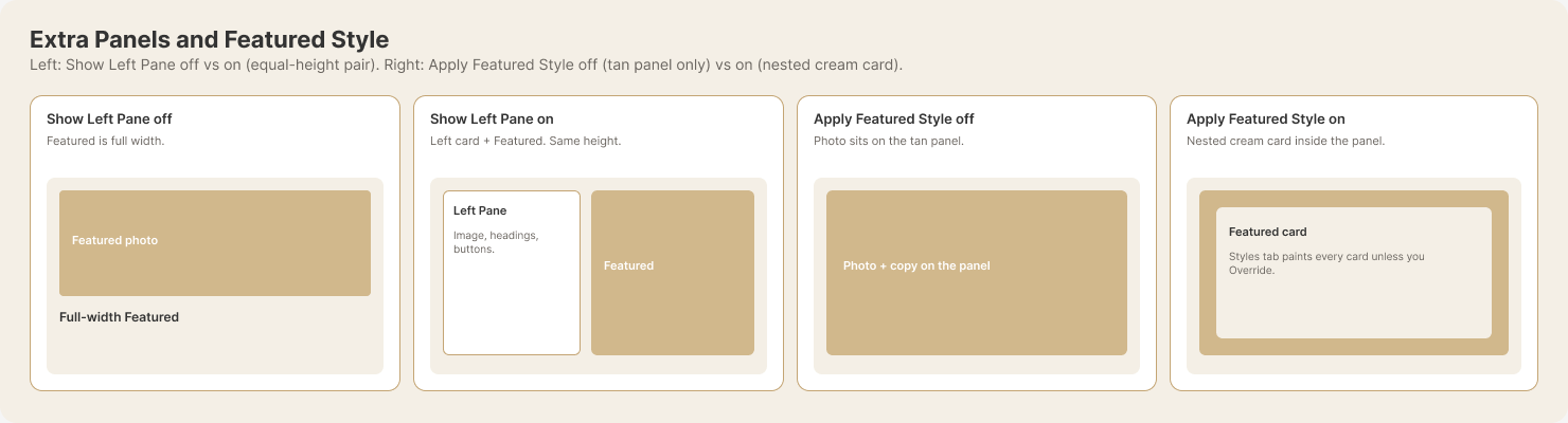
Show Left Pane off = Featured full width. On = left card + Featured as an equal-height pair.
Left two cards: Show Left Pane off vs on. Right two cards: Apply Featured Style off vs on (see also the Featured Style question).